Placemaking and Icon of the Seas

This article about Icon of the Seas, the largest cruise ship in the world -for now- has interesting lessons for placemakers. I will pass on the obvious (different types of food, multiple programs, movable furniture, varied environments from very active to very passive, changing decors and atmosphere, etc...) to briefly mention the larger themes I see here.


At 8,000 passengers plus crew, this is a town. A full town, with NO CARS at all, and I bet most people will get their 10,000 steps a day. It is also a very dense town where people are paying much more on a per-day basis than they would in their own homes. And it is more than just a floating mall in that the experience encompasses all the hours of the day, and seeks to please a multitude of audiences -retirees, young couples, and families, all at once. As environmental concerns and issues around loneliness and alienation become ever more pressing in our cities and suburbs, here is a model of socialization and gathering that runs counter to most planning models dominant in the US today, and yet successful, even beloved as we discovered in this story.


I can't help but compare the thinking that supported the creation of the Icon passenger experience about the public space life on Icon to that of the futuristic and sterile plans for Neom's "The Line" in Saudi (at least what has been shared online for now) which looked to be missing all the sense of fun and desire to be together that Icon seems to offer.

https://www.nytimes.com/2024/02/09/travel/icon-of-the-seas-cruise-royal-caribbean.html?smid=url-share

Case Study: The Allen Street Malls

Editor’s note: This is the second in a series of examinations of various public spaces in New York City. This series will focus on current ownership, programming, and maintenance of public spaces, as well as examining possibilities for future improvements.

Introduction to Allen Street Malls

A well-manicured, well-maintained section of the Allen Street Malls.

What is it? Thirteen center-median public spaces running south from Houston Street to South Street through both the Lower East Side and the eastern edge of Chinatown. Nine segments are called “The Allen Street Malls” and four are “The Pike Street Malls.”

Who runs it? There is no dedicated manager, but portions of the Malls are serviced by the Lower East Side BID and portions by the Chinatown BID. Additionally, the Malls are designated as a NYC Department of Parks and Recreation space, with the customary green maple leaf signage.

Why we’re writing about it: It’s an under-utilized public space that’s been stagnating in the middle of a very nice, but half-finished, renovation for the last ten years.

Stretching about a full mile from the south side of Houston Street in the bustling Lower East Side, the Allen Street Malls provide a mix of shade, seclusion, protected bike lanes, benches, and tables along its concourse until they end (after turning into the “Pike Street Malls,” when Allen Street turns into Pike Street as you cross East Broadway), rather scenically, at the base of the Manhattan Bridge and the posh One Manhattan Square condo at the corner of Pike and South Streets. The viewpoints here are exceptional, although they have yet to be discovered by the tourists who make the corner of Washington and Water their home in DUMBO across the river.

Sounds great, right? Only one teensy little problem: although the first of the 13 malls was renovated well over 15 years ago, only FIVE of the 13 segments have been completed. The other 7 were never even started. Even more weirdly, the first three segments south of Houston are unrenovated, until you hit Delancey Street. Then the next three, between Delancey and Hester, ARE renovated. Then the next five, between Hester and Madison, are unrenovated. The final two, between Madison and South Street, ARE renovated.

Confused yet?

So are we, alas. The renovated sections feature full canopies of trees (which all the malls have, fortunately), but they also have tons of other small trees, bushes, plants, and flowers, as well as winding pedestrian and bike paths, nicer benches, tables and chairs, and other features.

The unrenovated sections? Long uninterrupted slabs of concrete, with the northbound/southbound bike lanes bracketing the outside of the malls. Large trees, lighting, garbage cans, a few mismatched benches–that’s about it. 

The agony and the ecstasy: an unrenovated section of the malls.

Current Conditions as of 2023

Renovated, but with sanitation/maintenance issues: we’re more than halfway there.

The conditions of the malls vary so widely from block to block that it’s impossible to make one specific statement about them. The lower malls, both the renovated and unrenovated sections, seem to be a bit better maintained, with fewer sanitation issues (which could also be due to the fact that the lower malls have less pedestrian usage), while the upper malls are littered with garbage, broken bikes, random objects (while still being used by all sorts of folks, even given their serious sanitation issues). 

Section 1: Unrenovated Malls Between Houston and Delancey Streets

All the weight of the world: here’s all the things you CAN’T do here…in three languages.

If you hit Allen Street Malls from the upper end, at Houston Street, you’re greeted with this dumpy, below-eye-level sign that lists a lot of prohibitions about what you can and (mostly) can’t do at the malls. Here’s another shot:

The last segment of the unrenovated first three malls, just north of Delancey Street, sports a closed bathroom building that is also fenced off:

It’s currently a sad state of affairs that could be transformed from a neighborhood eyesore to a true asset. 

Section 2: Renovated Malls Between Delancey and Hester Street

Well, we all know interesting things happen when you cross Delancey, right? Because as soon as you hit the next mall segment, you have a giant sea change: the malls have been fully renovated with more greenery, sculptures, pavers, bike lanes, better benches, and tables and chairs.

Lots of greenery, lots of garbage: complexity and contradiction on the Lower East Side.

It’s clear that this renovation makes these segments much more desirable and more highly trafficked; unfortunately, sanitation and maintenance have not kept up with this higher-use model. There is garbage strewn everywhere, pavers are cracking, and there is graffiti in evidence. 

The four malls south of Delancey have been made into two extra-long segments, as both Stanton Street and Hester Street are closed to crosstown traffic; only Grand Street bisects the malls with thru traffic. However, the southern half of the second long segment (running between Hester and East Broadway) is unrenovated as well.

Section 3: Unrenovated Malls between Hester and Madison Streets

We now get to a five-mall section that is completely unrenovated and has the most serious ground/structural issues. Many of these sections are totally devoid of charms, if not pigeons. The bike lanes now run on the outer edges of the malls; bare benches don’t improve the situation. The less said about this section of the malls, the better.

Construction is as construction does: not exactly a beautification initiative.

Section 4: Renovated Malls between Madison and South Streets

Once again, the aesthetic shifts sharply simply by crossing a street; this time it’s Madison Street and the malls are now “The Pike Street Malls” as Allen Street has a new name down here.

Well, this looks nice!

Not only are the “inset” bike lanes and pavers back, but there are some nice curved benches, tables and chairs, greenery, and a noticeable lack of garbage strewn about. Maintenance is happening here, even though it is made easier by the fact that these segments may not be as highly trafficked as the malls further to the north.

The malls then end rather dramatically as the Manhattan Bridge soars over the FDR Drive, while the giant glass Manhattan One Tower rises to the left and the massive Manhattan Bridge base hulks to the right. While there is no visual connection to the park underneath the FDR Drive, the bike path on the malls connects rather easily to the bike path running north/south under the FDR.

The grand finale. Exeunt.

How to Improve The Malls–Cheaply

Well, we don’t know if it’s cheap, exactly, but since 5 of the 13 malls have been renovated to a particular spec, why not the other 8? There are no major structural issues in redoing the unrenovated malls: everything is surface-level, with the main features being a much more protected biking experience, much more greenery with new plantings, new benches and other furniture, and new lighting and trash bins.

A second step does need to happen, however: the existing malls need to be better maintained, specifically the renovated segments between Delancey and Hester. There’s no point in making these malls beautiful only to junk them up again by not picking up the garbage and removing the graffiti. Any cracked pavers should also be replaced. These small steps will increase use and will foment a greater degree of civic engagement, and it’s cheap at the price.

But as with so many projects we come across, the main issue of the Malls is underuse. The new design of the renovated portions is lovely, but it is separated from the vibrancy of the retail streetfront on either side. There are very few “things to do” here, and the result is that homeless folks who are being chased around the neighborhood (the NYPD is making an effort to clear them out of nearby Sara D.Roosevelt Park where many children play) dominate the space. It is a downward spiral from there. The solution: maintenance, cleanliness, and activity.

It is not looking good

Bringing the Project to a New Level

This is where we start to talk about how to improve the malls that have ALREADY been renovated, as well as suggesting that when more malls ARE renovated, that these initiatives are in place from the beginning. For instance, what can make these malls more engaging to passersby? Is there a place on the stretch of malls for an outreach center, a coffee or other kiosk, or other public service? Can these malls be programmed the way a park or a public space can be programmed? 

The answer to all the above is yes. Here’s some specific suggestions:

String Lighting

Adding string lighting to the malls would utterly transform these spaces after dark. Everyone who even gets the merest glimpse of the string lights, from any direction, would immediately want to go and investigate to see what was going on. The friendliness and camaraderie that string lights over a well-lit, well-maintained public space, should be considered. It’s a $5 solution to a $10 million-dollar problem. The current light fixtures, beautiful and modern, are perfectly fine but they do not make a space. They simply provide the minimum standard of nighttime lighting. This is the type of work that the local BIDs could put in place easily and cheaply. 

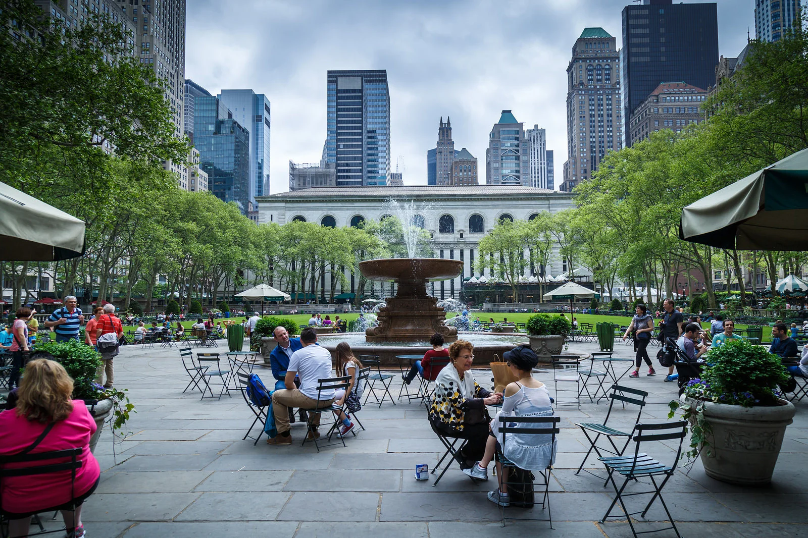
A bit more overall lighting would not hurt either, the poles could be upgraded to twin heads, as was done in Bryant Park years ago. This would also promote a sense of safety in the evenings. Fiat Lux!

Conversion of Bathroom to Coffee Kiosk/Information Booth

The classic kiosk on the north side of Delancey Street, formerly a dual men’s/women’s bathroom, is hearkening back to a bygone era where cities provided public places of relief for residents. It is not in use but it is standing. The chances of this becoming a functioning bathroom in the future are infinitesimal, but it certainly wouldn’t be the worst idea. However, we think it’s much more fun and practical to consider this to be a great place to provide both a coffee option as well as an information booth–a booth that can be occasionally occupied by both members of the Lower East Side and Chinatown Business Improvement Districts. Both BIDs could hand out information, direct visitors, and gather survey data on the malls and the surrounding neighborhoods. Parks should hand out a 50-year lease to anyone serious who is willing to invest to renovate and improve the building. 

If Money Was No Object…And Why Would it Be?

The Malls, besides the completion of their renovation, require two main elements: daily programs that will bring them into the life of the neighborhood, and a better integration with the street. 

Daily programs are truly key. The space now is abandoned to the user of last resort, with few exceptions such as where some of these fixed chairs and tables are:

But overall the space is bleak and a missed opportunity to enliven a very vibrant part of the City. Someone needs to care here, and do so every day even in the face of short-term problems and antisocial usage. There could be games, movable seating, garbage cleanup, the integration of a kids playground, and commerce. Sanctioned, legal, commerce would do a great deal to make the malls come alive.

Finally, there is the conception of the design of the upgraded malls itself. Mexico City has excellent examples of center street malls  - such as around Amsterdam Street or Mazatlan, which benefit from the luxurious local climate and sustain rich, colorful plant life. There they are an escape from narrow sidewalks and mostly residential environments. The Allen Street Malls are different. They exist in a much busier place, alongside fully commercial streetfronts. Still, In Mexico City, they have numerous openings, including midblock, that make it very easy for pedestrians to “jump” into the protected central section of the street and stay there. In contrast, the Allen Street Malls only allow entry at street corners and most people are likely to only cross or continue on the main sidewalks. The Malls are a destination that requires effort rather than a way to make one’s path around town faster, easier, and more pleasant.

Even the renovated sections should be reconsidered to provide mid-block crossings, as well as visual cues that will encourage people to divert their path toward the Malls.

In Conclusion

The Allen Street Malls are a good idea with enormous potential to define a beautiful corridor in Manhattan. But to fulfill that role, rather than drag down the area, the place requires leadership: both optimistic and indefatigable. The hope that someone else will do something or that a capital project alone will cure all ills will not solve the problems of the Malls.  A good way to do this would be to create a dedicated “Friends” group and enlist both local institutions (BIDs and others) as well as the Parks Department of other relevant city agencies, as well as some of the larger owners, investors, and businesses to provide momentum and some resources for the project. That’s the best–and probably only–way that the needle can move on this current underutilized public space.

A Place At The Table

Jerome and I happened to be in Raleigh, North Carolina for a business meeting when we encountered A Place At The Table (APATT). We thought it’d be a great topic for an article in The ADRR (as well as Town Square clients’), as it touches on many ideas that downtown leaders and stakeholders will find of considerable interest as they deal with the homeless in their districts. Here is the APATT story.

Introduction to A Place At The Table

What is it? A 3600 square foot breakfast/lunch cafe in downtown Raleigh, NC.

Who runs it? Founder Maggie Kane, now Executive Director of its 501(3)(c) nonprofit

Why we’re writing about it: It’s a “pay what you can” cafe with a paid staff, a volunteer staff, “pay it forward” donations, and a mission that serves a critical need in any major urban downtown that is experiencing a homeless crisis.

It’s just turning 8 a.m. on a Wednesday morning, and the line has already formed at this unassuming cafe on West Hartgett Street in downtown Raleigh. But instead of it being a line full of just one type of client (student, hipster, business executive), the line instead is a melange of all the above, also including homeless individuals, some of whom have their belongings with them. 

Going inside, the place is cheery from the outset, as the cafe employs a “greeter;” it’s also got quality linens, nice lighting, flowers on tables, good fonts, and signs with not only the menu, but also with the philosophy and practices of the cafe.

And what a model–it’s essentially three-tiered, with an option to pay the suggested price, paying less than the suggested price, or volunteering an amount of time at the cafe to cover the cost of your food. You can also pay for additional “pay it forward” cards if you want to sponsor someone else’s meal or make a donation on top of your meal.And all of these things are noted on boards around the cafe–how many volunteer hours, how much has been collected in “pay it forward” donations, how many cups of coffee the cafe has served, etc. 

All in all, it’s a bustling, friendly place with both a paid staff and a volunteer staff, and with 4.8 ratings on both Google and Yelp going back five years, it’s obviously considered a staple of the neighborhood, as opposed to just a quirky little project that someone dreamt of.

Of course, A Place At The Table IS a quirky little project that someone dreamt up-her name is Maggie Kane, and as we spent more time with her, we became increasingly impressed with both her and her model, as it’s essentially an Anarchist Cafe operating in a downtown American city. Below is her story.

Being Maggie Kane

Maggie graduated from North Carolina State University in 2013; in college, she worked at a day shelter “for people experiencing homelessness.” The shelter served about 100 people a day, serving coffee and basic sandwiches. But she made such a connection with the patrons that about ten of them came to her college graduation–and she knew then that food could be a connection through which advocates could connect with folks in need.

She also realized that most soup kitchens and shelter food services did not offer much choice. She made two key observations:

  1. People have more empowerment when they can make choices about their food

  2. People feel more seen and acknowledged when they are given choices about their food

So Maggie decided to work on a new concept in Raleigh, creating a space where formerly “invisible” people could come together and experience being acknowledged, instead of being ignored. She visited the F.A.R.M. Cafe in Boone, NC, and saw the “pay what you can” model working there, and she found more than thirty other places around the country running similar models.

The Process Begins: 2014-2018

Maggie developed the following principles as part of her research, and outreach:

  • Pay as you can model

  • Offer “good food for all regardless of means”

  • Don’t make the restaurant feel different from other restaurants

  • All menu prices are suggested. People can pay less, or more, or can work to pay.

  • A family can’t come any time if it can’t pay. 

  • You have do so something in order to eat there. It is a “hand up” not a “hand out.”

Next, she gathered a team of people who had experience with poverty, and visited a different non-profit every month, pitching her concept. She also did many pop-ups to test different elements of the program, including Saturday setups at different restaurants with a “pay as you go” model. She kept testing the ideas and slowly built word-of-month; at the same time, both “fundraising” and “friendraising” was started, and she had raised $500,000 by 2017.

For Maggie, she believed that the model would only work if it was financially viable–not that it necessarily “turned a profit,” but that the funding was appropriate and consistent between actual money earned at the cafe, supplemented by donations and grants that kept the operation consistently open. She held finance meetings monthly and realized that the right space would be key–eventually sourced by York Properties, who had a long history of working with non-profits in the area. Additionally, Maggie got help from local restaurants such as BUKU, who helped with the pop-up model and are on the board, as well as friends that called many landlords, almost all of whom passed on the opportunity.  

2018: The Cafe Opens

When Maggie finally opened the cafe in January 2018, she was paying full market rent, with a space half the size that it is today, 5 years later. Originally it was 6 paid staff, which has now grown to 20. She was finally able to quit her other job, which she had had until 2017, but from the very beginning, the cafe exhibited many of the traits that Maggie had originally planned: that it looked the same as any other restaurant, that the menu prices were suggested, that people could “work off their meal” by volunteering, or that they can “sponsor” a card to pay for someone else’s meal. Corporate partners can also buy cards to pay for other meals, and they have access to the cafe, as well as the cafe’s other non-profit partners.

Naturally, this project had fully consumed Maggie for 5 years, and now she knew that to keep it going, she’d have to hire more staff or experience burnout, including 2 main chefs, baristas, a manager for the volunteer, staff, and more. Then the pandemic hit.

Ironically, it turned out that the pandemic wound up being a catalyst for increasing the square footage from 1500 sq ft to 3600 sq feet, and having the business go from 100 customers a day to 250-300 a day–prompting the need for a true commercial kitchen to be installed. It also meant that the cafe needed a security guard, and that its insurance premiums also rose as a consequence (including insurance for volunteers, liability, and health insurance for staff). 

2023: The State of the Union

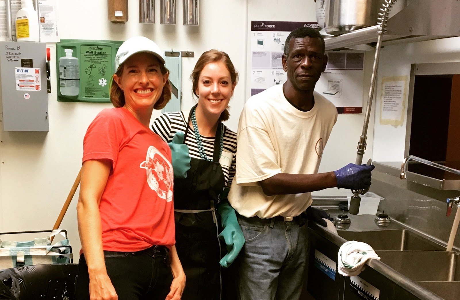
Going into the cafe today means being greeted by a well-oiled machine that involves more than 100 daily volunteers, many of whom work a weekly shift, and some of whom pay for their meals. All the volunteers work alongside actual paid staff, including Cheyanne,a community and de-escalation specialist who is the cafe’s community manager and volunteer door greeter (and conflict de-escalator). 

The cafe’s goal is to treat people with love and respect, and all new staff are required to work alongside the volunteers, to ensure that they are a good fit. The staff begin at $19/hr, pegged as a “living wage” for this part of the country. Rent is also still at market rate. Consequently, only half of the cafe’s operating budget comes from receipts–the other half is still from individual, corporate, and religious donations. A yearly gala and daily fundraising at the cafe are also part of the model.

The Clientele

The cafe’s clientele are split down the middle–half pay the menu price or donate even more than their meal by doing a “pay it forward,” and half pay less or work off their food credits. The cafe has high ratings on both Google Maps and Yelp (the aforementioned 4.8) because Maggie continues to insist that it needs to compete as a restaurant and not just as a social endeavor. 

More importantly, the clientele is made up of many returning customers, all of whom are made to feel cared for, by being greeted and acknowledged. Volunteers chat with everyone who comes in the door, explain the model, lead you to the counter where you can order, and bring you your food. Conversations happen constantly, while, at the same time, staff are trained to be alert for any potential arguments or difficulties. Communal eating, staff remembering the names of patrons, and all patrons being thanked and said goodbye to when they leave–these are all specific techniques that the cafe employs to keep its mission on point.

One of the key experiences of the cafe, according to Maggie, is that the poor and isolated, many of whom are invisible to all but a few aid workers on a daily basis, are now seen and acknowledged by the general population. While “creating a sense of community” is many times stated as an (eventually empty) goal that gets bandied about by urban planners, architects, and activists in proposals and mission statements, A Place At the Table has been able to do just that–by realizing that actual work by staff, and actual training of staff, are the only ways to create a community; you can’t just build out a “cool space” somewhere and hope that a community will magically adopt it. Maggie has chosen food as her tool to reach people and create a community; however, food isn’t the only tool that can create community. 

There is a deeper challenge at work here, as well. With the greater popularity comes additional situations that require awareness and tact; for the cafe, Cheyanne is the key person–she uses kindness as her first and foremost tool, but lets other staff intervene when necessary, always with the goal of de-escalating any potential dangerous situation–especially since substance abuse and alcohol addiction are very prevalent.

Nonetheless, the cafe has seen many success stories, where volunteers and others in transition acquire transferable skills, can use the cafe as a reference, and simply gain confidence by their association with the cafe. The cafe offers culinary internships, not all of which work out, but some do. There is no silver bullet except hard work and dedication to the mission–and, even then, there are folks that don’t respond to the cafe’s mission.

Notes on the Future

As 2023 draws to a close, Maggie is looking forward to feeding more people, perhaps with a food truck or by helping others launch their own operation–always with the goals of solidifying and expanding the existing community that the cafe has fostered. But she cautions that every new venture needs to adjust to its local environment, and that every venture needs all kinds of partners and supporters–financial, physical, spiritual and otherwise.

This will be the challenge going forward in every major city that is struggling to “contain” or “ameliorate” its homeless and at-risk population challenges–how to bring these populations back into “mainstream” society, where they have the chance to feel self-worth, to interact again with society at large (since many of them had such interactions in the past), and to hopefully move beyond their current situation. 

A Place At The Table is just one building block in a much more multifaceted solution, but there’s no reason that it can’t be duplicated in dozens of Downtowns in the country. It’s reducing the fear of “downtown blight” by not hiding, or removing, disadvantaged folks, but by bringing them out in the open and having them interact with people who might normally have a fear of interaction, or otherwise consider their presence to be a stain on the city, instead of an opportunity for interaction and community.

We wish Maggie all the best and we’d love to know what you think!

Links:

A Place At The Table: https://tableraleigh.org/

Maggie Kane TedTalk: www.ted.com/talks/maggie_kane_food_for_thought_choice_and_dignity

Boone’s F.A.R.M. Cafe: https://www.nccommunityfoundation.org/

List of other places with this model:  https://www.oneworldeverybodyeats.org/find-a-cafe

Case Study: Atlantic Terminal Outdoor Plaza

Editor’s note: This is the first of (hopefully many!) examinations of various public spaces in New York City. This series will focus on current ownership, programming, and maintenance of public spaces, as well as examining possibilities for future improvements.

Introduction to Atlantic Terminal Outdoor Plaza

The Plaza on an average day.

What is it? An unnamed street-level triangular plaza atop Atlantic Terminal, bordered on its three sides by Atlantic Terminal Mall, Atlantic Center, and the Barclays Center.

Who runs it? Real estate services firm Cushman & Wakefield on behalf of Madison Realty.

Why we’re writing about it: It’s an under-utilized public space on one of Brooklyn’s busiest corners.

It’s quite possible that there is a busier intersection in Brooklyn than the Atlantic Avenue-Flatbush Avenue intersection, but if there is, we don’t know it. For one, it is the cornerstone of several Brooklyn neighborhoods–Fort Greene expands outwards from its northeast corner, Prospect Heights from its southeast corner, Park Slope from its southwest corner, and Boerum Hill/Downtown Brooklyn from its northwest corner.

Secondly, it sits atop one of the busiest rail terminals in New York, the LIRR Atlantic Terminal station, which features connections to 2, 3, 4, 5, B, D, N, Q, R, and W subway trains, as well as being the terminus for the Atlantic Branch of the Long Island Railroad.

Standing at street level from the southeast corner of this intersection, one can look across Atlantic Avenue and see the 3-story Atlantic Terminal Mall across the street; next to this mall but connected by a 2nd-story footbridge to the east, across Fort Greene Place, sits Atlantic Center, a second 3-story mall. Behind you, on the southeast corner of the intersection, sits the steel-clad Barclays Center, now flanked on its three “back” sides by condominiums. 

On the west side of Flatbush Avenue, to the southwest, sits a currently (as of 2023) shuttered one-story Modell’s Sporting Goods store and a currently open P.C. Richards electronics store, while, to the northwest, another small triangle housing the lone one-story Flemish-style Times Control House, a small kiosk or “headhouse” designed by master architects Heinz & LaFarge in 1908. Beyond the kiosk, Boerum Hill, with its four-story rows of brownstones and shops, begins to stretch out.

The two streets themselves, Flatbush Avenue and Atlantic Avenue, are two of Brooklyn’s busiest, as the 10.3-mile Atlantic Avenue runs west to New York Bay and the Brooklyn-Queens Expressway, and east across Brooklyn and into Queens, where it ends at the Jamaica Long Island Railroad Terminal, while the 9.9-mile Flatbush Avenue heads northwest and connects to the Manhattan Bridge and eventually Canal Street on the Manhattan side of the East River, as well as southeast through many Brooklyn neighborhoods, eventually winding up connecting to the Marine Parkway Bridge and the Rockaways.

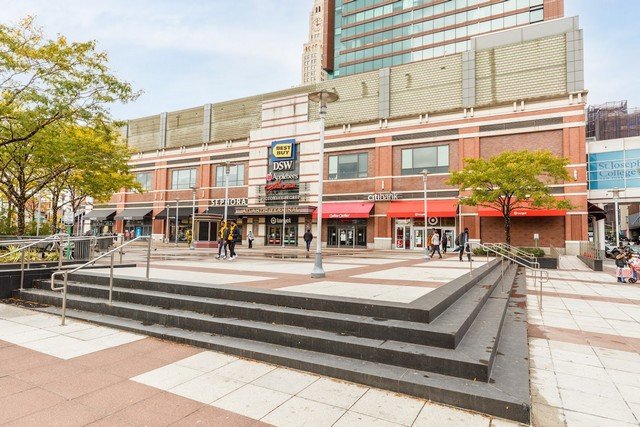
The Plaza is at the center of enormous activity but contributes nothing to the neighborhood.

That’s a lot going on all in one place, even for New York City. And one would think that such a junction would somehow be demarcated, if not beloved, by, well…something. Yes, the 40-story Williamsburgh Savings Bank Tower rises majestically behind Atlantic Terminal, and yes, the Barclays Center, with its curved cor-ten steel cladding, swooping lines, and green roof provide a modern architectural counterpoint to the Byzantine/Romanesque style of the Savings Bank Tower. But these two architectural standouts are unfortunately counterbalanced with the utter banality of the Atlantic Terminal Mall, the Atlantic Center Mall, and the one-story Modell’s and P.C. Richard’s stores. 

Of course, this site was originally demarcated by the two-story Flatbush Avenue station, now demolished. This station originally took up the footprint of both the current Atlantic Terminal Mall as well as its outdoor plaza; over the decades, it fell into greater and greater disrepair as more and more of its original architectural highlights (such as its glass roof) were covered over or left to crumble into dust. Consequently, the final decision was to demolish and build a new station (if any of this sounds familiar, we’re assuming it’s because you know the story of the original Penn Station in Manhattan).

And, just like the demolished Penn Station, the new “solution” to creating a modernized, user-friendly hub was to keep all the tracks and terminals buried so far below ground that almost no natural light could get through, and cover over everything with tons of concrete and utterly charmless architecture.

Ironically, however, some outdoor space was actually reclaimed in the building of the new Atlantic Terminal; thus, the creation of the triangular outdoor plaza we have today.

Current Conditions as of 2023

The current triangular space sits a few steps above grade right in front of one of Atlantic Mall’s entrances. There is a bank of trees, bordered by a two-foot high polished stone wall, that separates the main plaza from Atlantic Avenue. People can and do sit on this wall, facing outward south to Atlantic Avenue, as well as sit on the half-dozen benches on the plaza side of the tree bank; the trees do provide sunlight to bench-sitters in the afternoon. A small unmanned information kiosk also sits in the plaza. 

As for the three-story high wall of the Atlantic Terminal Mall itself, there are some awnings jutting out from the first-floor businesses, a small awning above the entrance to the terminal and identifying it as such, and logo-specific signage above the entrance to the terminal for (as of 2023) Best Buy, Guitar Center, Applebee’s, and DSW, while Target’s logo is below the terminal awning. Other shops have logos or signage on either side of the terminal entrance. At no point does the entrance to the terminal tell pedestrians anything about their being a major transit hub underneath it–there is no LIRR or MTA signage whatsoever on this side of the building.

The plaza is generally well-maintained and kept free of garbage or other detritus; the Fort Greene Place side of the plaza is very busy 7 days a week with many cars dropping off and picking up passengers who have large shopping carts from either the Target or the Stop n’ Shop across the street at Atlantic Station Mall. Finally, there is a large row of Citibikes that sit between the sidewalk and Atlantic Avenue itself.

As for events, an October “Fall Festival” event was on the Atlantic Terminal calendar, but no other events were listed for the following six months between November 2023-April 2024..

That’s the crop.

How to Improve The Plaza–Cheaply

There’s a few simple steps that can be taken to “warm up” the space. Before we do anything, though, the space itself needs an actual identity. It’s currently an unnamed plaza. Can we come up with a famous Brooklynite to name it after? Doesn’t really matter who–a writer, a baseball player, a politician, anyone. We could then book an event where we dedicate this new space to this person, whoever it is. 

Along with an identity, we would then add signage to the plaza identifying it as such. This would be the first step in some sort of branding of the space. Branding can take place with something as minor as a commemorative plaque or sign, or go further into a set of banners or flags or een a billboard that boldly announces, from more than one sightline, what the plaza is.

Along with the signage, we can post a set of rules and regulations for the space as well. This tells park users what activities can and can’t be done within the boundaries of the space. While this seems to be an authoritarian step, most or all of the rules can be “positive action” rules–telling people what they can do in the park as opposed to what they can’t do in the park. This may then give people ideas for what they could use the space for–and they would then actually use it in that way.

Bryant Park’s rules signage is as much about what one can do as about what one can’t.

Next up, we would propose removing the unmanned, rather useless information kiosk with an actual functional coffee or taco kiosk concession instead. Any easy food will do. While this would slightly increase the footprint of the current kiosk, it would provide a service that is lacking in the area (especially with the Starbucks closing across the street at the Barclays Center!), and keep people IN the plaza for longer periods of time. Non-window sides of the kiosk can still display any information that the terminal and/or mall wish to communicate to people, as well as all sorts of community notices. The rebuilt kiosk can also include signage with the plaza name as well, taking care of the identity and branding issues that the plaza currently has. The location is ideal for a signature kiosk that, given the volume of activity here, could do tremendous business.

A kiosk, such as this famous example of Lisbon’s outdoor stands, will do much for the Plaza.

Along with the coffee or taco stand itself, folding chairs and tables can be scattered about the plaza, allowing folks to remain longer and warming the space up with actual users. Many, many small parks have these tables and chairs throughout New York City (and other cities of course), and their presence promotes longer stays as well as provides people a chance to enjoy whatever they’ve purchased for consumption at the coffee/food kiosk. It also prevents any kind of unwanted use (such as skateboarding) to take place in the space during the day while the tables and chairs are distributed throughout the space.
Currently the space is an uninterrupted triangle of off-white stone, cross-hatched with lines of red stone, creating large rectangles as seen from above. We could reclaim a few of these rectilinear grid spaces as islands of plants, with perhaps more benches or chairs abutting these islands. This would create a bit more green space within the plaza and “break up” the large expanse of triangular stone in front of the terminal. Umbrellas, planters and movable furniture will transform the place and help make it a destination.

Greeley Square did not have much to recommend it to users, but planters, umbrellas and movable seating transformed it into a PLACE.

Finally, the lighting within the plaza is provided by a series of silver light poles; the lighting and the poles themselves are sufficient, but painting the poles black would create a bit more elegance and move the visual away from the slightly industrial-looking silver-gray. 

Bringing the Project to a New Level

If more funding were available for this newly-named plaza, a second series of steps could be initiated. Many of these would focus on providing additional amenities to the plaza that would keep people there longer. 

For instance, the installation of electric outlets and charging ports would provide an additional amenity for plaza visitors to linger and enjoy the space for longer periods of time. 

Power outlets are the joy of regulars in Bryant Park. 48 are available for use!

In summer, shade sails could be installed that block the sun’s most powerful, overhead rays, providing a bit of respite from the heat of the city. Another cooling option would be a small water fountain that would double as both a second visual counterpoint to the newly-installed food kiosk, as well as provide cooling and seating functions to plaza visitors. At night, string lights would warm up the space; strings can emanate from the rebuilt kiosk and radiate outwards to the corners of the plaza, defining the shape of the plaza and creating a cozy space for folks to linger after dark. The kiosk can easily remain open later into the night given the business of the terminal, the mall, and the Barclays Center.

No lighting is more effective than string lights to make people feel good in public spaces.

Finally, we can start, at this level, to begin to bring in art programs to the plaza. Either a permanent or rotating sculpture could (probably in lieu of the water fountain) be placed as a counterpoint to the kiosk; additionally, murals can be painted on level three of the Atlantic Terminal building (perhaps something that tells folks about the LIRR and subway stations underneath, similar to the wonderful subway art programs the MTA funds?) and/or the Atlantic Center building, which currently has two giant blank spaces above its two hideous Atlantic Avenue portals (the Burlington Coat Factory and Marshalls entrances).

Good murals come to define places, as this one at the York Street subway entrance.

If Money Was No Object…And Why Would it Be?

At this level, we can begin to actually program the newly-named plaza with more events. These can be daytime or even early evening concerts or busker programs, morning child-friendly events such as sack races or egg tosses; impromptu events such as building snowmen during snow days, and other craft or music programs, perhaps sponsored by businesses within the mall such as Target, Guitar Center, and Chuck E. Cheese. A serious holiday decor would also be most welcome. 

An artificial climbing boulder requires little space but will become a children’s favorite.

Given the number of children that visit this area (between Chuck E. Cheese and just being in tow while their parents shop at the malls), additional child-friendly activities could be installed. If neither the fountain nor the permanent sculpture was created, a climbing structure could be put into the plaza instead; additionally a slide could perhaps be installed from the second floor of the Target for kids to use. 

On the actual corner of Atlantic Avenue and Fort Greene Place, a full information kiosk could be installed, with information about the stores, the terminal, the Barclays Center, and tourist information on Brooklyn. This would be in additional to the information that can be put on the some of the sides of the food kiosk.

Finally, a flag program can be installed either around the perimeter of the space or perhaps coming out of the top of the building–either flags from around the world, or all 50 states, or perhaps custom-designed flags representing all the neighborhoods of Brooklyn. These types of visual redesigns would breathe new life into the currently unnamed, underprogrammed plaza.

The dynamism of the flags on Fifth Avenue contributed to establish the commercial success of the street.

In Conclusion

While the list above would seem fraught with roadblocks of all kinds, such as maintenance issues, funding problems, permitting challenges, and more, the only thing that we know for sure is that this current unnamed, underutilized space is ripe for the challenge of having it be something more that it currently is. And we’re happy to be part of the conversation.


Interesting archival photos of the old station:

http://www.trainsarefun.com/lirr/Atlantic%20Branch/Atlantic%20Branch.htm

https://gothamist.com/arts-entertainment/flashback-lirrs-old-flatbush-ave-terminal

http://arrts-arrchives.com/FAT1Rext.html

http://arrts-arrchives.com/FAT2int.html

Keep outdoor dining after COVID

Keep outdoor dining after COVID

COVID-19 has bestowed an abundance of misery on New York, but one of the public initiatives in reaction to the calamity warrants our attention as we think about the long-term future of the city. I am talking about the city’s excellent decision to allow restaurants to claim the sidewalk and parking space at the curb alongside their street frontage for table seating.

Two ways to draw repeat visitors to your park

Two ways to draw repeat visitors to your park

Imagine that you are a first-time visitor to the Rose Kennedy Greenway, or maybe Klyde Warren Park, or even Bryant Park. In fact, you could stroll through any of the new urban parks that are redefining downtowns across America. Unless the weather was particularly bad, you would immediately notice how many people are there, and all the varied sorts of activities…

Food Carts and Trucks: a Proposal

As I write, it appears that the City of New York is getting ready to give in to vendor advocates and greatly expand the number of mobile food vending license it makes available. While observers of the impact and mechanics of the mobile food vending business might be surprised by such a decision, particularly in the wake of the thorough piece by Jeff Koyen in Crain's, I started wondering about what this vast program should look like.

The Urbanism of Zootopia

The Urbanism of Zootopia

One of the advantages of having children is benefiting from a bridge to media and culture that you would not enjoy otherwise. But for my kids, would have I have ventured to discover how Snapchat works? Would I care about Descendants, or the 100 or Fifth Harmony? Probably not. But to remain a part of their lives I follow what is of interest to them. Thus, a few days ago, we went to see Disney's latest animated movie: Zootopia.

What does "World Class Public Space" mean?

What does "World Class Public Space" mean?

Each new public-space project brings hopes and aspirations for renewal--the vision of a city changed for the better. As the stakeholders behind a project set on their journey of transformation, they typically will share their ambition what is to become. Invariably, this effort will proudly proclaim that the new park (or beach, or sea-side pier) is to be a "world class public space."